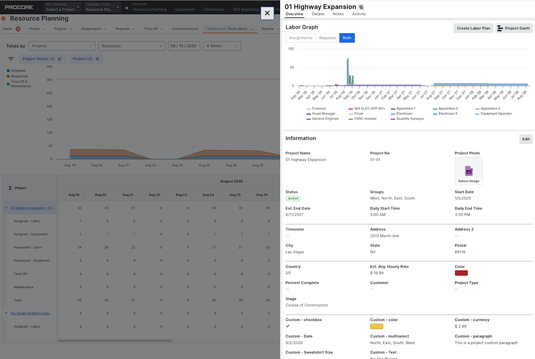
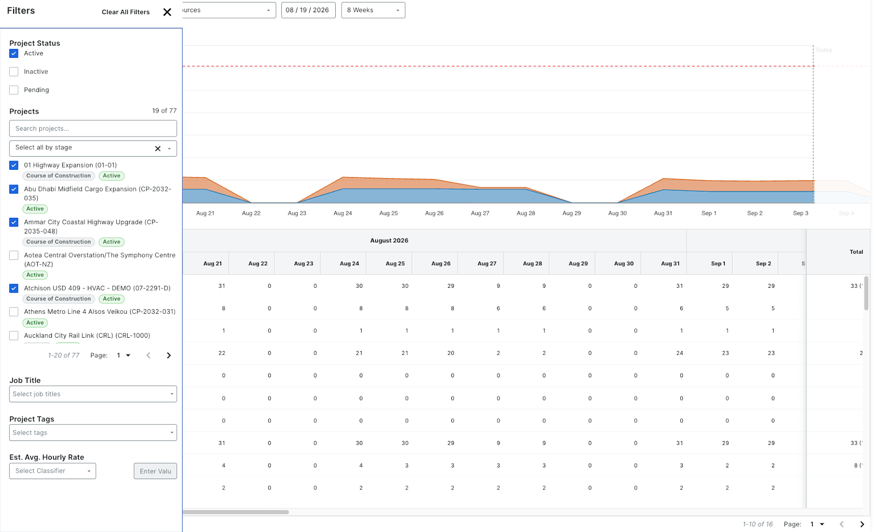
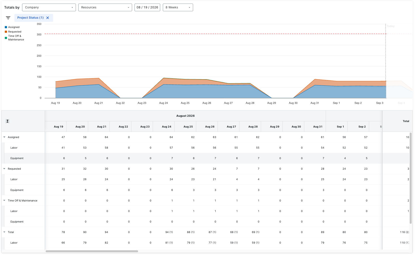
What it is: The Resource Forecast dashboard (formerly Totals) is rebuilt from the ground up: an interactive resource chart now sits above the data table, equipment is tracked alongside labor for the first time, over-capacity periods are flagged clearly in red, and users can switch between six units — people, hours, days, FTE, cost, and utilization — to answer different planning questions from one page. Who it's for: Workforce and resource planners answering the question "can we staff this job?" — across a company, a project, or a specific resource. Why it matters: The previous dashboard was table-only, so teams rebuilt the capacity picture in spreadsheets to see trends. A visual forecast with labor and equipment together means planners spot over-capacity periods instantly and make staffing decisions from Procore instead of exporting to figure it out. How to get started: Available as an open beta. Opt in through Procore Explore, then open Resource Forecast in Resource Planning. Available October 13, 2026